


Analytics & Reporting Summer 2026 Release Notes
Article Links
Timeline
When will this be released?
UAT Preview Window: Jul 2, 2026
Note: AI Summary and Custom Analytics Dashboards are not available on UAT
Production Availability: Jul 30, 2026
Is there downtime for this release?
No.
Analytics Custom Dashboards
We are introducing Analytics Custom Dashboards, providing you with the flexibility to design data reports that align with your agency’s unique strategic goals.
Important note: Analytics Custom Dashboards are currently available in private preview, with a public preview scheduled for later this quarter ahead of general availability.
Dashboard Organization
You can now manage your dashboards using two distinct tabs:
- Private: Use this space to build personal dashboards.
- Shared: Use this space to collaborate on and publish dashboards for your entire agency.
How to Create a Custom Dashboard
To get started, ensure you have an active Explore license. (Please reach out to your CSM if you’re interested to have explore license).
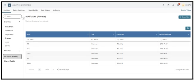
- Start: Navigate to Analytics and select the Private tab.
- Create: Click the Create New button.
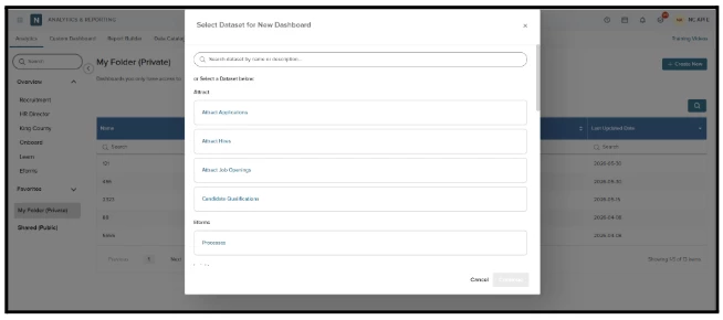
- Choose Data: Select a dataset from the dialog. The system automatically populates this list based on your specific product access.
-
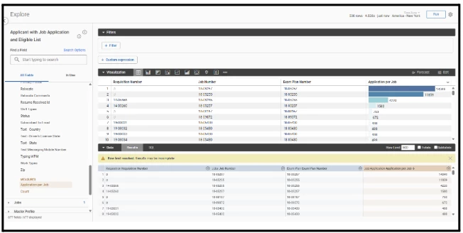
Design: Add fields onto the canvas to aggregate your metrics.
- Customize your dashboard by adding fields from the left menu as columns or filters. Filters applied at this stage affect only the specific tile you are editing.
- Use the default measure - highlighted in orange - to quickly build your tiles.
- Visualize: Select your preferred visualization type, such as charts or graphs.
-
Run: Select Run to see the results.
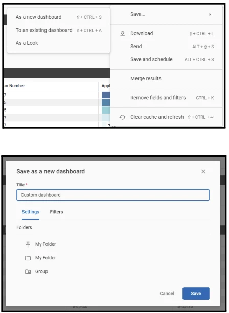
- Save: Save your work as either a "Look" (a single, reusable data tile) or a "Dashboard" (a canvas containing multiple tiles).
Note: At this step, you can choose whether to save it in a private or shared (group) folder.
Advanced Reporting: Multi-Tile & Cross-Product Dashboards
Scale your reporting by combining multiple data sets:
- Open your saved dashboard and click the three dots (...) icon, then select Edit.

- In the navigation bar, select Add, thenselect Visualization.
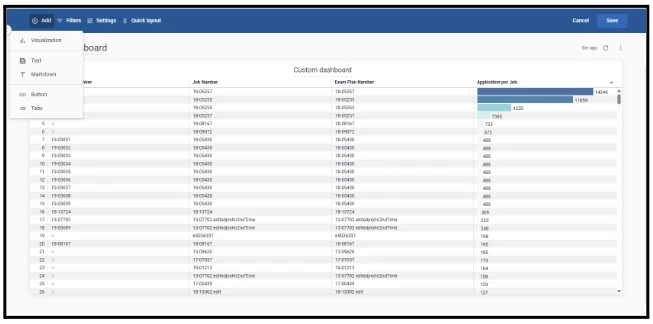
- Select any dataset to add a new tile.
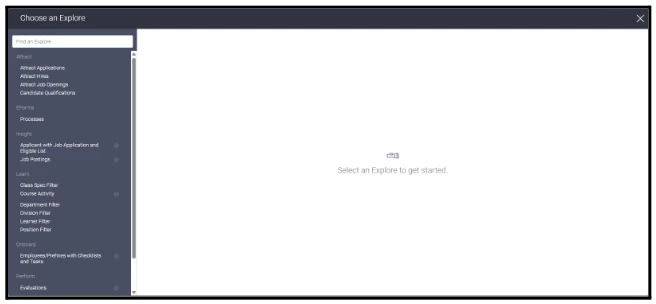
Note: You are not restricted to your original dataset; you can select an entirely different dataset for each tile (e.g., combining Insights data with data from another product). This cross-product compatibility allows you to unify disparate data streams into a single, comprehensive agency overview.
- Configure your fields and visualization style, then save the tile to your canvas.
Applying Global Filters
To filter data across your entire dashboard:
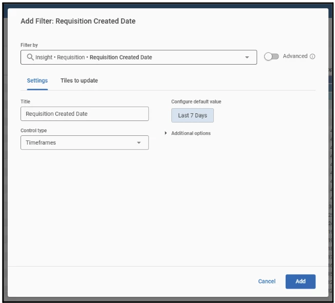
- While in the Edit view, select Filters, then select Add Filter.
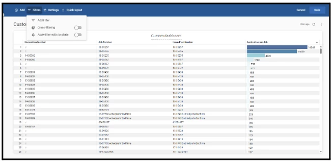
- Define your filter criteria.
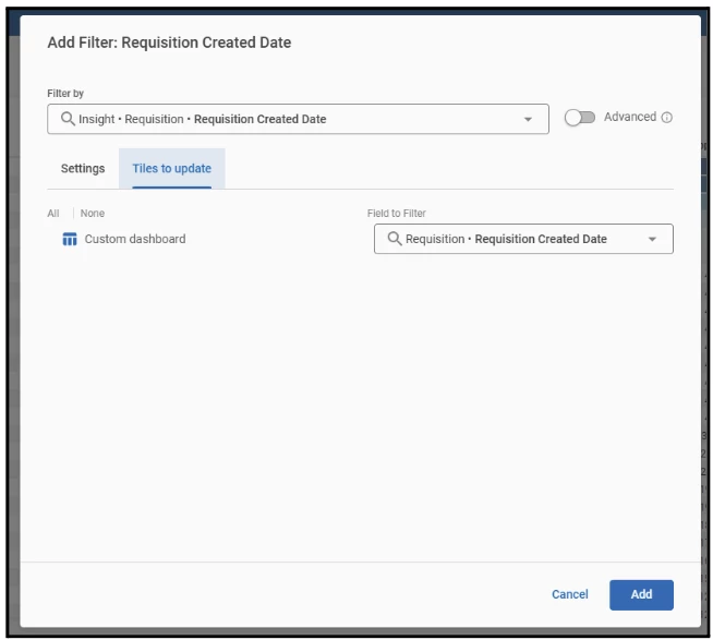
- Under the Tiles to Update configuration, select the specific tiles that should respond to this global filter.
Collaborating with Shared Dashboards
Facilitate teamwork through the Shared tab, which provides a central space for collaboration.
Permission levels are determined by licensing:
- Full Access: Users possessing an Explore license have the authority to modify or remove dashboards within this tab.
Tip: Because the system saves the most recent version of a dashboard, please coordinate with your team before making changes to avoid overwriting one another's work.
- Limited Access: All other users are restricted to view-only permissions.
Dashboard Customization & Layout Controls
When you enter Edit Mode, the top navigation bar provides advanced tools to refine your dashboard’s design.
Expand Your Dashboard Layout
Use the Add menu to enhance your dashboard beyond standard visualizations by including contextual elements:
- Text: Add a text field anywhere on your canvas to include notes or descriptions.
- Markdown: Create a text tile using Markdown or HTML. This allows you to add stylized headings, links, or images to customize your dashboard’s appearance.
- Button: Place clickable buttons on your dashboard to link users to external sites or other internal resources.
- Tabs: Use tabs to organize your dashboard into multiple pages, keeping your views clean and structured.
Configure Dashboard Settings
Use the Settings panel to control your dashboard’s behaviour and data presentation:
- Time Zone Adjustment: Change tile-level time zones to apply a single, consistent time zone to your entire dashboard.
- Data Refresh Frequency: Automate data updates by switching from manual refreshing to a scheduled refresh interval (e.g., "Refresh Every...").
- Filter Panel Layout: Adjust how your global filter suite appears. You can collapse the filter section or change its position to maximize your available screen space.
AI Summary for dashboards
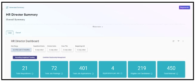
Save time and gain immediate clarity with our new AI-generated summaries. By selecting Summarize on any dashboard, you can instantly generate a high-level overview of your data, including key performance metrics and automated recommended actions.
Important note: AI Summaries are currently available in private preview, with a public preview scheduled for later this quarter ahead of general availability.
How to Use
- Generate: Navigate to your dashboard and select Summarize. After confirming the data processing acknowledgement, the system will instantly analyze your metrics.
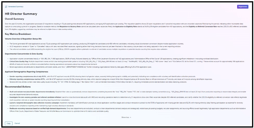
- Explore Insights: Once the summary panel slides into view, select Show more to expand the window. This allows you to view comprehensive breakdowns, including demographic completeness and suggested recommended actions.
- Share & Communicate: To use these insights in your communications, select Copy to save the text directly to your clipboard for use in emails or reports.
This feature is now live across all user dashboards.
Pay Transactions Report Enhancement
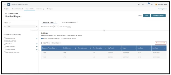
We have introduced the new Time Code Value field to improve reporting accuracy for modified payroll entries. This update ensures that Pay Transactions reports reflect the final calculated hours, rather than just the initial entry, which helps reduce discrepancies between payroll batches and generated reports.
Users can find the Time Code Value field under the Maintain Pay Transactions section within the Pay Transactions report.
How to Use
- Add the field as a column, chart element, or filter to your existing reports.
- Use it to create calculated fields to further customize your data analysis.
Value
This enhancement is designed to assist payroll administrators by providing better visibility into the actual hours processed following manual edits.
Audience
Payroll user with access to report builder
Example:
A payroll administrator can now report on time entries to see the actual hours processed after manual edits.
Preferred Name
We have introduced a Preferred Name field to the employee details. This optional field allows employees to specify how they would like to be addressed.
The Preferred Name field is now available across the following reports and analytics dashboards:
- Onboard
- Learn
- Perform
- eForms
- Core HR
- Payroll
- Benefits
- Time & Attendance
You can easily add the Preferred Name field to your reports by navigating to the following sections:
- Employee Section: Use this section for Onboard, Learn, Perform, and eForms reports.
- Identity Section: Use this section for Core HR, Payroll, Benefits, and Time & Attendance reports.
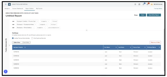
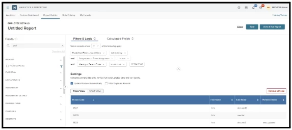
Once located, you can incorporate this field into your reports as a column, chart element, or filter, or use it to create calculated fields. Please note that because this field is optional, the column will appear blank for any employee who has not defined a preferred name in their profile.