
Article Links
Timeline
When will this be released?
Release Date: 04/16/2025.
Is there downtime for this release?
No.
New Top Navigation
We're excited to announce a major enhancement to the NEOGOV platform: a comprehensive redesign of our navigation system. In response to user feedback and to address usability challenges, we've transitioned from the complex left-hand navigation to a streamlined top navigation layout. This new design not only simplifies the user interface by reducing redundancy and clarifying navigation paths but also prepares us for future expansions, including the integration of the Admin Center.
Initially rolled out for the HCM system, this update aims to significantly improve user satisfaction and support a more intuitive and efficient journey across our platform. Enjoy a more cohesive and enhanced experience with the new top navigation, tailored to elevate the overall functionality and appeal of NEOGOV.
This release introduces key enhancements to the Unified platform aimed at improving user experience and accessibility across all products. The new App Switcher provides seamless navigation with a consistently accessible top navigation, categorizing products based on permissions for intuitive access.
The enhanced search functionality now includes product-specific categories and best-matching results, ensuring efficient information retrieval while the sticky View all feature simplifies comprehensive searches.
The Help section has been strategically relocated to the top navigation bar, offering direct access to support resources depending on user entitlements, while the new calendar design ensures intuitive global access to scheduling tools across the Unified platform. Additionally, the enhanced notification system ensures you stay informed with immediate access from the top navigation bar, maintaining continuity across all products.
The Tasks feature introduces immediate task management from the top navigation, and the settings icon improves accessibility to product-specific configurations.
An enhanced user profile component provides streamlined access to settings across the platform, and a reimagined sub-navigation bar offers structured access to key features based on user permissions.
Collectively, these enhancements deliver a consistent, efficient, and user-friendly experience across the Unified platform, streamlining workflows and ensuring you have immediate access to essential tools and resources.
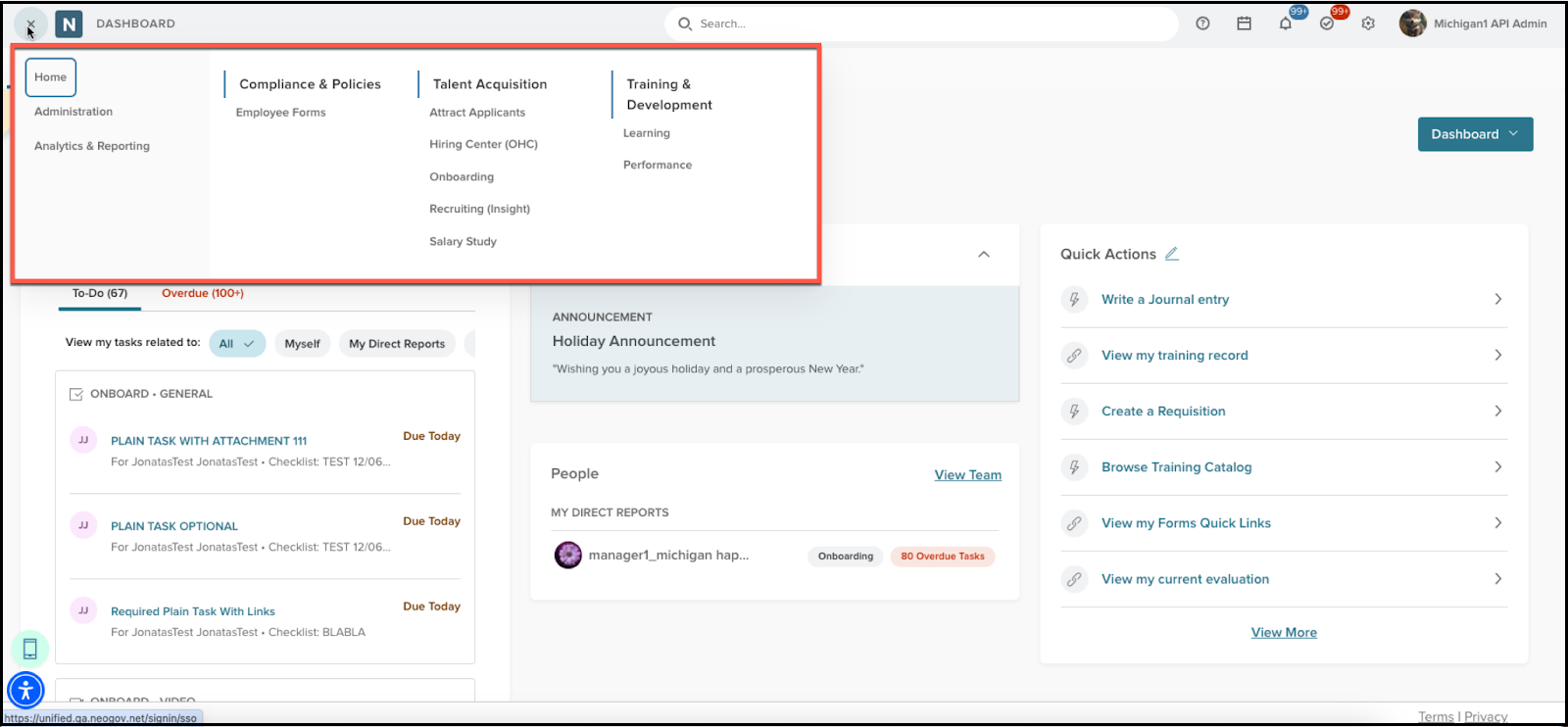
App Switcher
This feature provides users with easy access to all assigned products, organized into intuitive categories based on permissions. Always visible across user sessions, the App Switcher simplifies navigation by displaying three standard options at the forefront: Home (Now Dashboard), Administration, and Analytics & Reporting, serving as the unified landing page.
Additional NEOGOV products are neatly categorized for seamless navigation, including:
- Talent Acquisition: Attract, Government Jobs, Recruiting (Insight), Background Investigations (Vetted), Hiring Center (OHC).
- Training & Development: Learning, Onboarding, Performance, Training (Progress), Field Training(Ready).
- People Management: Benefits, Core HR, Payroll, Employee Forms.
Compliance & Policies: Accred, Action Reporting, Internal Affairs, Policy Management, Professional Standards(PSS), Recall. - Engagement & Wellness: Engage, Wellness (Line), Employee Surveys, Early Intervention (Vitals).
- Workforce Management: Scheduling, Time & Attendance.
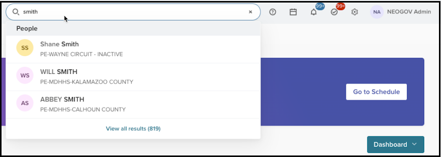
Search
Introducing a new search component for the top navigation across our products, designed to improve your search experience by displaying all possible results within product-specific categories.
- Product-Specific Search Categories
- The search component is tailored to each product, reflecting its unique set of categories for more relevant results.
- Best Match Display
- Up to three best match results are shown per category.
- If no results are found within a category, it will not appear in the search results.
- Comprehensive Result Navigation
- When more than three results are available in a category, a View all results (x) call to action (CTA) will be displayed at the bottom.
- The x indicates the total number of results matching your search term.
- Clicking View all results (x) takes you to the full search results page of the product, if available. This link will not appear if the product lacks a full search results page.
- When more than three results are available in a category, a View all results (x) call to action (CTA) will be displayed at the bottom.
- Sticky View All Button
- The View all button will remain sticky at the bottom of the search result module for easy access.
- Informative Search Results
- Each search result includes a required avatar (for employees/people) or an icon representing the category.
- Name/title information is prominently displayed.
- Optional product-specific secondary and tertiary information is available, separated by periods or small circles.
- Clear Messaging for No Results
- If no results are found, you will see this message: No results for x. Try adjusting your search term to find what you are looking for.
- Direct Navigation
- Selecting any search result will navigate you directly to the relevant destination for a seamless experience.
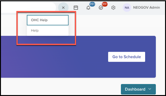
Help
This release focuses on enhancing the visibility and accessibility of the Help section, allowing users to quickly find the support they need from anywhere within the platform.
- Help Section Relocation
- We’ve relocated the Help section from the profile dropdown menu to a more prominent position on the top navigation bar. This makes it easier and faster for you to find assistance wherever you are on the platform.
- New Help Navigation Features
- A dedicated Help icon is now located in the top navigation bar. Clicking on this icon provides you with access to two key help resources.
- General Help Section: Selecting this option will open the community page in a new browser tab, providing you with a wealth of general support resources and community interactions.
- OHC Help Section: This option will directly navigate you to the OHC Help page, offering specialized support for those using the OHC product.
- A dedicated Help icon is now located in the top navigation bar. Clicking on this icon provides you with access to two key help resources.
- Conditional Access to OHC Help
- The OHC Help option is exclusively available to those who have access to the OHC product.
- If you don’t have access to OHC, the Help icon will only direct you the general help section. In such cases, you will not see the dropdown menu with multiple help options. This streamlines your access to assistance.
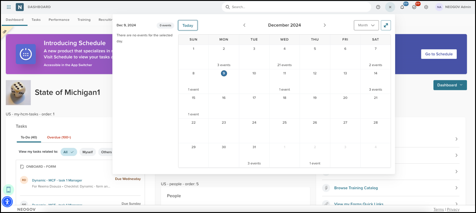
Calendar
We’ve introduced an improved calendar experience within the Unified platform. This update aims to enhance user interaction by providing seamless access to the calendar from the top navigation, ensuring consistency and ease of use across the platform.
- New Calendar Design
- The calendar component has been updated with a fresh design, offering an intuitive and user-friendly interface. This new design not only enhances the aesthetic appeal but also improves functionality and ease of use.
- Global Calendar Access
- The calendar is now a global component readily accessible from the top navigation bar across the Unified platform. This ensures that users have instant access to their calendar without having to navigate through multiple menus.
- This enhancement allows users to efficiently manage their schedules and appointments from any section within Unified.
- Consistent Functionality Across Products
- Ensuring a seamless experience, the calendar retains its functionality when users navigate between Unified and any other product within the platform. This uniformity eliminates the need to relearn calendar functions and aids in maintaining consistent workflow.
- Full Page Calendar Navigation
- Selecting the calendar component from the top navigation immediately redirects users to a comprehensive, full-page calendar view. This feature provides users with a detailed overview of their schedule, allowing for easier management and planning of events.
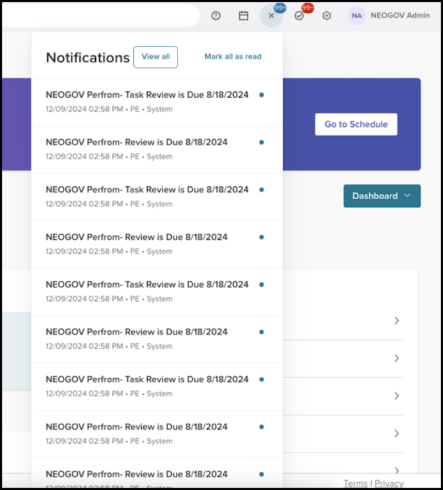
Notifications
We’ve enhanced the notification experience across our platform, designed to keep you informed and up-to-date with ease. With the new Notifications feature integrated into the top navigation bar, users can now access their notifications effortlessly from any product within the platform, ensuring that important updates are never missed.
- Notifications Icon
- We’ve added a new notification icon in the top navigation bar, which provides consistent access to notifications across all products. The icon includes an indicator to alert you of any new or unread notifications, maintaining the current functionality for convenience.
- Persistent Access
- The notification icon remains persistent in the top navigation, regardless of which product you switch to, offering seamless access at all times.
- Notification Module
- Clicking the notification icon opens a module showing up to 15 notifications. You can easily distinguish between read and unread notifications within this module.
- Each notification includes a description, the date and time it was sent, the originating product name, and the source of the notification.
- View All Notifications
- You can view all notifications by selecting the View All link within the module, which navigates you to the comprehensive Unified Notification Center page.
- Mark Notifications as Read
- You can mark notifications as read by selecting them within the module. The Mark all as Read feature allows you to mark all notifications as read, which resets the notification count indicator to zero.
- Empty State Handling
- If there are no notifications, you will see an empty state with this message: You currently have no notifications. In this state, the Mark all as Read button is disabled, but you can still access the Notification Center using the View All link.
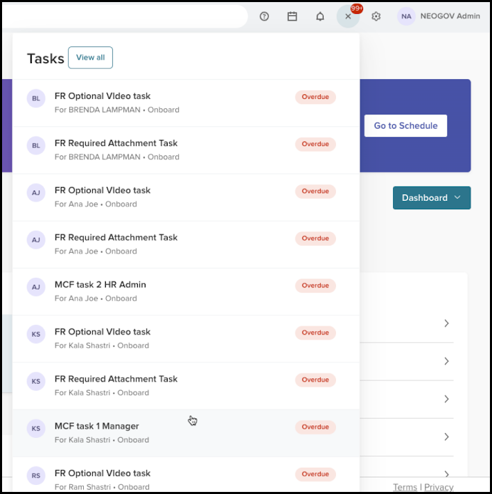
Tasks
We’ve added the Tasks feature to our platform's top navigation bar, providing you with immediate access to your task list across all products. This enhancement ensures that you can efficiently manage your tasks and stay organized without having to navigate away from their current workflow.
- Tasks Icon
- A new Tasks icon is now featured in the top navigation bar, enabling you to access your task list from anywhere within the platform.
- The icon includes an indicator for overdue tasks, keeping you alert to urgent items that require your attention.
- Persistent Access and Overdue Indicator
- The Tasks icon remains visible in the top navigation across different products accessed via the app switcher, ensuring consistent and easy access.
- The task indicator shows the count of overdue tasks, helping you prioritize urgent tasks effectively.
- Tasks Module
- When you select the Tasks icon, you will see a module showing your tasks. Each task includes:
- Task Title.
- Due Date.
- Assignee information including First and Last name, avatar (or initials if the avatar is unavailable), and the originating product name.
- When you select the Tasks icon, you will see a module showing your tasks. Each task includes:
- Task Navigation
- You can view your entire task list by clicking the View All link, which directs you to the Unified Tasks Center page.
- Tasks are shown in order of their due dates for easy prioritization.
- Selecting a task within the module navigates you to the respective product needed to complete the task.
- Task Visibility and Count
- You will see only your own tasks within the module, ensuring a personalized task management experience.
- The notification number reflects only the count of overdue tasks, resetting to zero when all tasks are current.
- Empty State Handling
- If you have no tasks, an empty state module shows this message: You have no tasks.
- The View All link remains active, allowing you to navigate to the Task Center for further actions.
- Task Display Limit
- The tasks module shows up to 15 tasks, providing a quick overview while keeping the interface uncluttered.
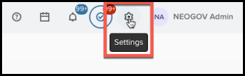
Settings
The Settings feature enhances accessibility to product-specific settings directly from the top navigation bar. This improvement allows you to effortlessly manage settings for each product within our platform, providing a streamlined and consistent user experience.
- Settings Icon
- We’ve added a new Settings icon to the top navigation bar, giving you a convenient access point to manage product settings from anywhere within the platform.
- The icon remains visible and accessible, ensuring you can quickly navigate to the settings page relevant to your current product context.
- Product-Specific Navigation
- When you select the Settings icon, you will go to the settings page for the product you are currently using, as determined by the app switcher.
- This product-contextual navigation ensures that you have quick access to relevant settings without unnecessary steps.
- Seamless Integration
- The integration of the settings feature into the top navigation ensures that you experience a consistent and seamless interface, no matter which product you are using within the platform.
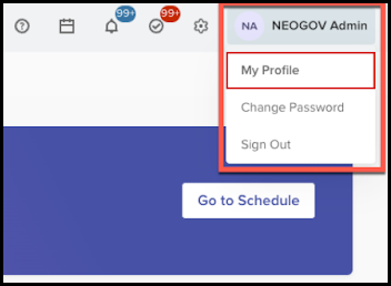
Profile
We’ve added a new enhancement to the user profile component, which streamlines access to settings and improves the experience across all products on our platform. This update introduces key functionalities aimed at providing a consistent and intuitive interface for managing your profile and accessing settings directly from the top navigation.
- User Profile Access in Top Navigation
- The user profile component is now prominently featured within the top navigation bar across all products on the platform, offering immediate access to user settings and features.
- Avatar Display
- If you are using a profile picture, you will see the picture in the top navigation.
- If you are not using a profile picture, you will see your initials, ensuring everyone has a personalized visual representation.
- Full Name Display
- Your full registered name is now shown next to your avatar in the top navigation for easy identification.
- Profile Dropdown Menu
- Click on your profile to show a dropdown menu.
- The dropdown includes a default Sign Out option.
- Selecting Sign Out will end the session and redirect you to the login page.
- Product-Specific Features
- The dropdown menu dynamically adjusts to include additional feature options based on the selected product and your permissions.
- Navigation to the corresponding feature page is seamless and efficient, ensuring smooth transitions between settings and features.
- Permission-Based Visibility
- To maintain security and relevance, you will only see feature options you have permissions for; inaccessible features remain hidden.
- Unified User Experience
- The updated user profile component offers a cohesive look and feel across all products, ensuring a consistent and familiar user experience, regardless of the product being used.
Sub Navigation
The latest enhancement to the Unified Suite introduces a new sub-navigation bar. This update is part of our ongoing efforts to streamline access to features and improve user experience. With this release, we’ve provided an intuitive and efficient way to navigate through the product suite using the newly designed sub-navigation bar.
- Sub-Navigation Bar Introduction
- We’ve replaced the traditional left navigation panel with a sub-top navigation panel to enhance accessibility and ease of use.
- The new sub navigation offers a seamless way to access key features and functionalities within the Unified Suite.
- Order of Navigation Items
- The sub navigation bar shows these items in a structured order for quick reference.
- Homepage.
- Tasks.
- People.
- Onboard.
- Time & Attendance.
- Pay.
- Benefits.
- Performance.
- Training.
- Recruiting.
- Forms.
- Reports.
- Surveys.
- Scheduling.
- The order ensures that critical features are prioritized and easily accessible.
- The sub navigation bar shows these items in a structured order for quick reference.
- Permission Driven Access
- Your user permissions determine what you see in the sub navigation, guaranteeing that you only see features and items relevant to your role and access rights.
- Enhanced Settings Access
- While the top navigation project is in progress, we’ve temporarily relocated the Settings page to the far right side of the sub navigation bar for easy access.
- Selecting the Settings icon will direct you to the existing Settings page.
- Improved User Experience
- We’ve added clear visual indicators (highlighting, underlining) to improve the visibility and navigation experience while interacting with the sub navigation features.
- Selecting an item from the sub navigation leads you directly to the corresponding feature’s landing page.
- Integrated Feature Access
- All feature landing pages load within the Unified Suite interface, keeping you in the same window for a cohesive user experience.
- Rapid transitions ensure the navigation improvements do not compromise any existing functionalities from the previous left navigation panel.
- Overdue Task Counter Adjustment
- We’ve temporarily removed the overdue task counter. We will revisit this feature and integrate it into the top navigation bar in an upcoming update.